Manufacturers regularly use statistical data to aid in designing their products and in scheduling production to meet the needs of the market place. By using statistics, we, too, can predict variability and use it to our advantage.
No two people or things are ever exactly alike. Not even identical twins are truly identical; each has unique personality traits. We have written our own names thousands of times, yet no two signatures are ever exactly the same.
These differences are called variations. When we measure these variations, group them by size, and then Plot the data, definite patterns appear. Understanding these patterns in historical data can be extremely useful when we have to make decisions about the future.
For example, have you ever wondered how Calvin Klein decides what sizes and quantities of jeans to produce? Common sense may tell them that they probably won’t sell many 50-inch or 12-inch waist sizes. So how many of each size in between should they make to meet market demands without ending up with sizes that do not sell?
The answer is statistics. Clothing manufacturers use statistics to predict the variation of body sizes for a certain population of consumers. Where do these numbers come from? One place is from demographics collected by the federal government. Uncle Sam routinely collects data about its citizens, which is then made available to the public. The data collected about us include our heights, weights, waist sizes, and leg lengths, which is also categorized by sex, age group, regional area, etc.
Of course, Uncle Sam doesn’t measure all 200 million of us, but rather settles on a small sample. Can we trust sample data to represent our total population? The answer is yes. Statisticians have shown that small samples, when properly obtained and analyzed, can accurately estimate an entire population. This is true whether we are measuring the variations in people, chemicals, nuts, bolts or almost any item.
Plotting a Sample
Suppose we wanted to know the height of our fellow employees. Just from casual observation, we might expect very few colleagues to be less than 58 inches tall (4 feet, 10 inches) or more than 78 inches (6 feet, 6 inches). Most people probably would be around 68 inches tall (5 feet, 8 inches).
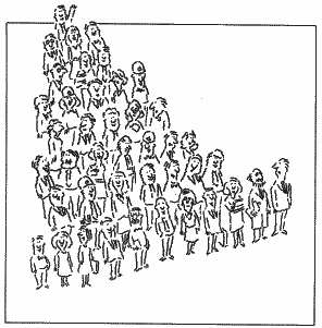
The cost and difficulty of measuring all 17,000 employees would be prohibitive, but we could obtain useful information by randomly measuring, say, one out of every 100 employees. If we measured the heights of this sample of 1 70 employees and then grouped them in one-inch increments, we might see a pattern as in Fig. 1. This tally is called a “frequency diagram” because it shows us how frequently we observed employees of a particular height. (It is also called a “histogram” when the columns are shown as vertical bars.)

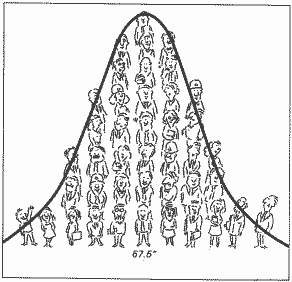
This arrangement of employees gives us a picture of how their heights are distributed. As we might expect, there aren’t many people very short or very tall, and the bulk of the people have heights gathered around some average value in the middle. We can now see that the average height of employees is about 67.5 inches. Drawing a smooth line through the data (Fig. 2) produces a bell-shaped curve.

As it turns out, this symmetrical bell-shaped pattern is one of the most commonly observed patterns of distribution in everyday life. In fact, it’s so common that it is called a “normal” distribution.
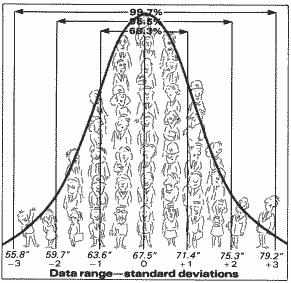
Statisticians divide the horizontal line under this curve into three equal segments above and below the average value and call these segments standard deviations (Fig. 3). The standard deviations above the average are called positive, while those less than the average are called negative.

The Normal Curve
Standard deviation tells us something about the range or “spread” of our data. For true normal distributions, the area under the curve (or in our example, the number of people) between the plus 1 and minus 1 standard deviations is always 68.3 percent of the total area under the curve (Fig. 3). The area between plus 2 and minus 2 standard deviations is always 95.5 percent of the total area, while the area between plus 3 and minus 3 is 99.7 percent of the total area. This means that for normally distributed data, 997 out of 1,000 data points can be expected to fall between plus 3 and minus 3 standard deviations. Or only 3 points out of 1,000 lie outside this range.
Our graph shows that about 68 percent of us are between 63.6 and 71.4 inches tall. These same statistics estimate that 99.7 percent of all employees are between 55.8 and 79.2 inches tall. That means only about 51 employees (0.3 percent) are less than 4 feet, 7 inches tall or greater than 6 feet, 7 1/4 inches tall.
Improved Decisions
How can this information help us? Manufacturers regularly use statistical data to aid in designing their products and in scheduling production to meet the needs of the market place. Similarly, insurance companies use statistical data to predict health needs and deaths by sex and age groups, and set their premium rates accordingly.
Important decisions are sometimes based on hunches or intuition, which can backfire. A better approach is to determine the pattern of variability by first collecting and plotting historical data, as we did in our example. If the data are normally distributed, as most data are, we can use the average and standard deviation to predict the likelihood that future data will fall in a similar range. Then, using statistics, we can predict future performance based on historical data to improve our decision-making process.


Recent Comments